Persistent Homology for Dummies
The purpose of this exercise tutorial is threefold:
· Introduce you to the usage of TTK in ParaView and Python;
· Introduce you to persistent homology from a practical point of view;
· Introduce you to the applications of persistent homology to medical data segmentation.
This exercise requires some very mild background in Python.
It should take no more than 2 hours of your time.
1. Downloads
In the following, we will assume that TTK has been installed successfully on your system. If not, please visit our installation page for detailed instructions HERE.Before starting the exercise, please download the data package HERE.
Move the tarball to a working directory (for instance called
~/ttk) and decompress it by entering the following commands (omit
the $ character) in
a terminal (this assumes that you downloaded the tarball to the
~/Downloads directory):$ mkdir ~/ttk$ mv ~/Downloads/ttk-data-0.9.3.tar.gz ~/ttk/$ cd ~/ttk$ tar xvzf ttk-data-0.9.3.tar.gzYou can delete the tarball after decompression by entering the following command:
$ rm ttk-data-0.9.3.tar.gz
2. TTK/ParaView 101
ParaView is the leading application for the interactive analysis and visualization of scientific data. It is open-source (BSD license). It is developed by Kitware, a prominent company in open-source software (CMake, CDash, VTK, ITK, etc.).ParaView is a graphical user interface to the Visualization ToolKit, a C++ library for data visualization and analysis, also developed in open-source by Kitware.
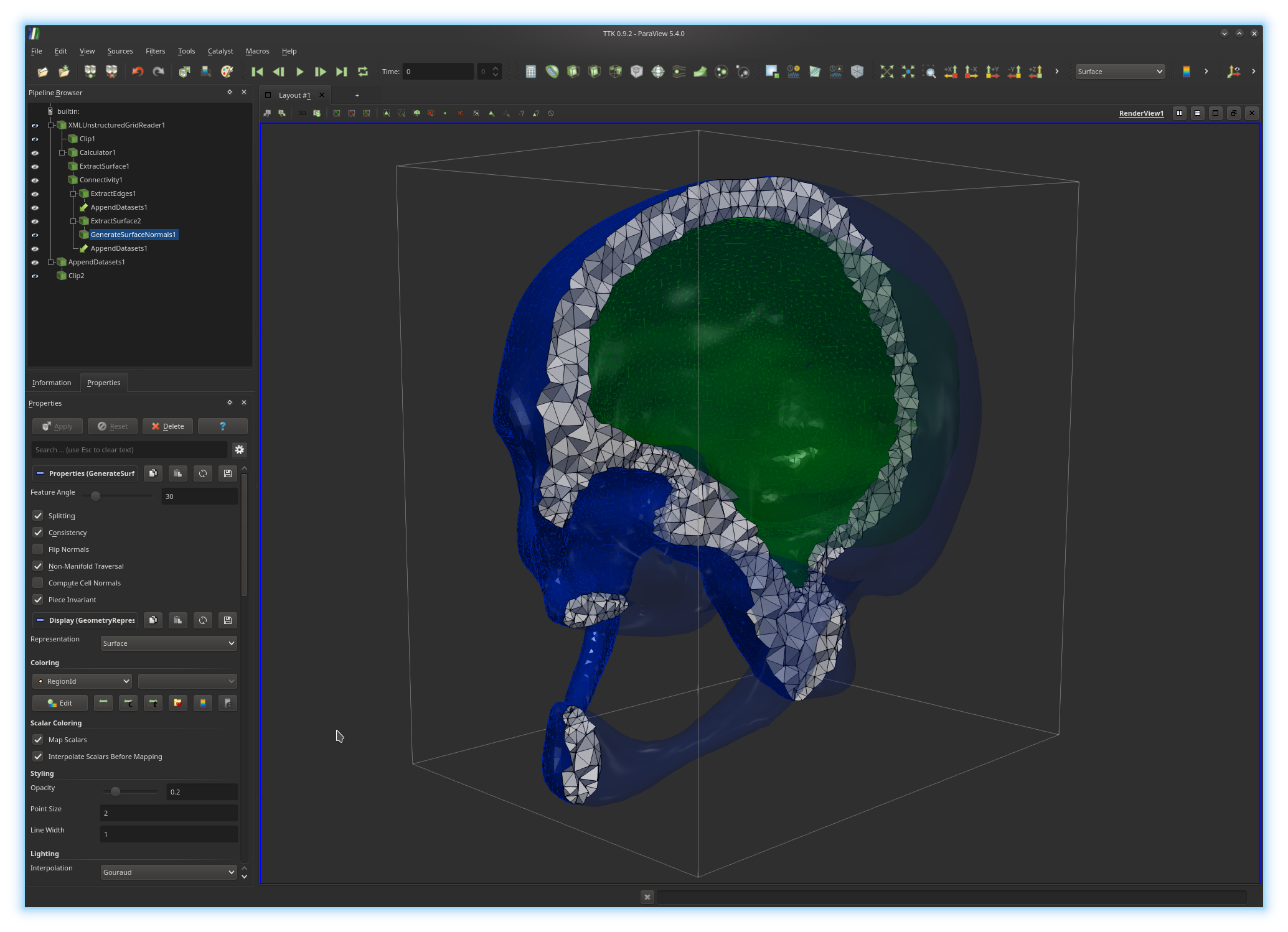
In the above example, the active pipeline (shown in the "Pipeline Browser", upper left panel) can be interpreted as a series of processing instructions and reads similarly to some source code: first, the input PL 3-manifold is clipped (
Clip1); second, the
boundary of the input PL 3-manifold is extracted
(ExtractSurface1), third the connected components of the boundary
are isolated and clipped with the same parameters as the rest of the volume
(Clip2).The output of each filter can be visualized independently (by toggling the eye icon, left column). The algorithmic parameters of each filter can be tuned in the "Properties" panel (bottom left panel) by selecting a filter in the pipeline (in the above example
GenerateSurfaceNormals1).
The display properties of the output of a filter in the main central view can
also be modified from this panel.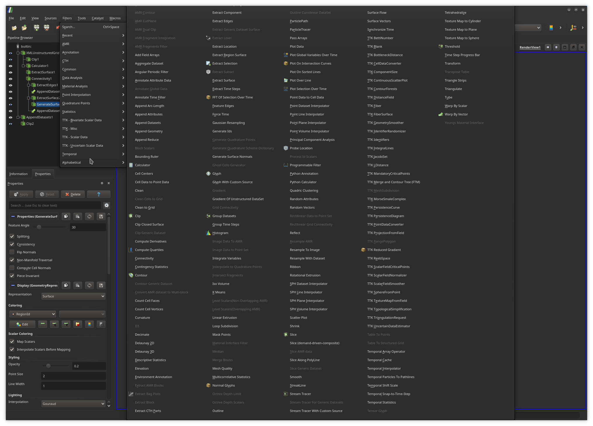
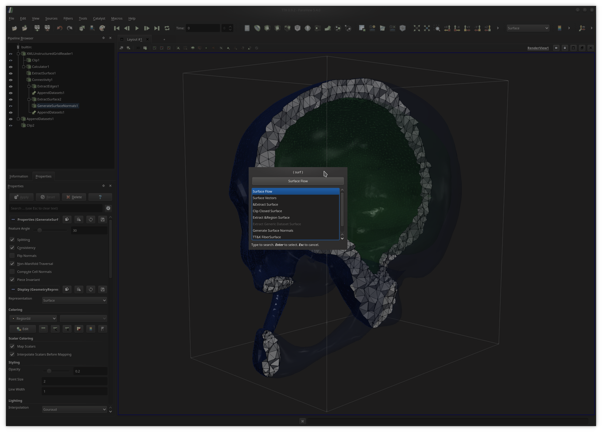
Ctrl+space keystroke (under Linux) and enter keywords
as shown above to quickly call filters.ParaView supports the rendering of multiple (possibly linked) views. To generate a new view, users simply need to click on the vertical or horizontal split buttons, located at the top right of the current render view. To link two views together (i.e. to synchronize them in terms of view point), users simply need to right-click in one of the two views, then select the
Link Camera... entry and finally click in the
other view they wish to link.Once users are satisfied with their analysis and visualization pipeline, they can save it to disk for later re-use in the form of a Python script with the menu
File, Save state... and choosing the Python
state file type. In the Python script, each filter instance is modeled by an
independent Python object, for which attributes can be changed and functions
can be called.Note that the output Python script can be run independently of ParaView (for instance in batch mode) and its content can be included in any Python code (the
pvpython interpreter is then recommended). Thus, ParaView can be
viewed as an interactive designer of advanced analysis Python programs.
To
learn more about the available ParaView filters, please see the following
tutorials:
HERE
and
THERE.
In the following, it is highly recommended to regularly save the current status of your analysis, by saving a
.pvsm state file with the menu
File, Save state... (ideally, on file per exercise).
3. Generating some toy data
Exercise 1
In the first part of this tutorial, we will experiment with some toy 2D data that we will synthesize ourselves. Open ParaView and simply call thePlane filter (also available in the Sources menu).
Create a new plane with sufficient values for the
parameters XResolution and YResolution (typically
100 each).ParaView supports real-time interfacing with the Python scripting language. For instance, by calling the
Programmable Source or the
Programmable Filter, users can directly type in Python commands to
either create or interact with data. We will make use of similar features to
create some 2D data to attach to our plane.
Specifically, we will use the
Python Calculator, which will enable us to provide, in Python, the
analytic expression of a 2D function to be considered as the input to our
topological data analysis pipeline.In particular, we will create a Gaussian function, given by the expression:
where
In ParaView, each filter can have multiple inputs. In Python, the first input of our
Python Calculator filter can be accessed by the variable
inputs[0]. The actual points attached to this input can be
accessed by its Points attribute: inputs[0].Points[].
Therefore, in your Python calculator, accessing the x
and y components of your current point p can be done
by considering the following expressions respectively:
inputs[0].Points[:,0] (for x) and
inputs[0].Points[:,1] (for y).Use these expressions of the coordinates of the input points to evaluate in your
Python Calculator the analytic expression of
Array Name parameter, typically gaussian0).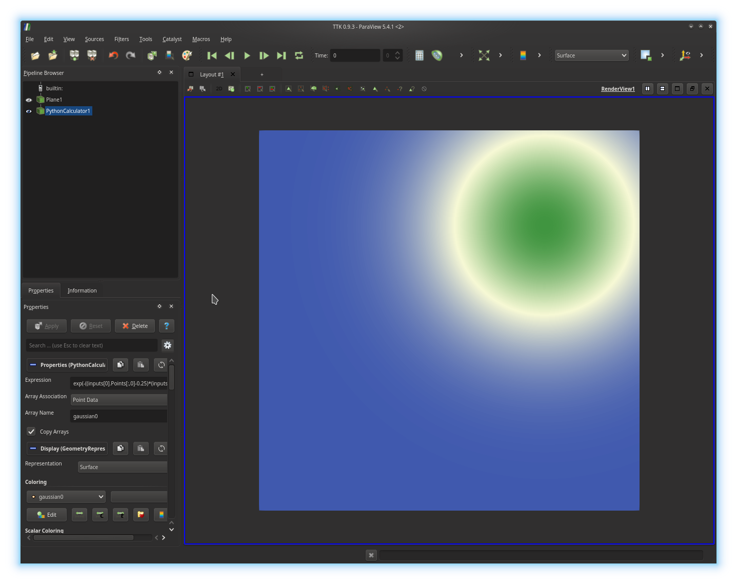
Python Calculator to blend
linearly the three Gaussians you generated into only one function, called
multiGaussian, as illustrated below: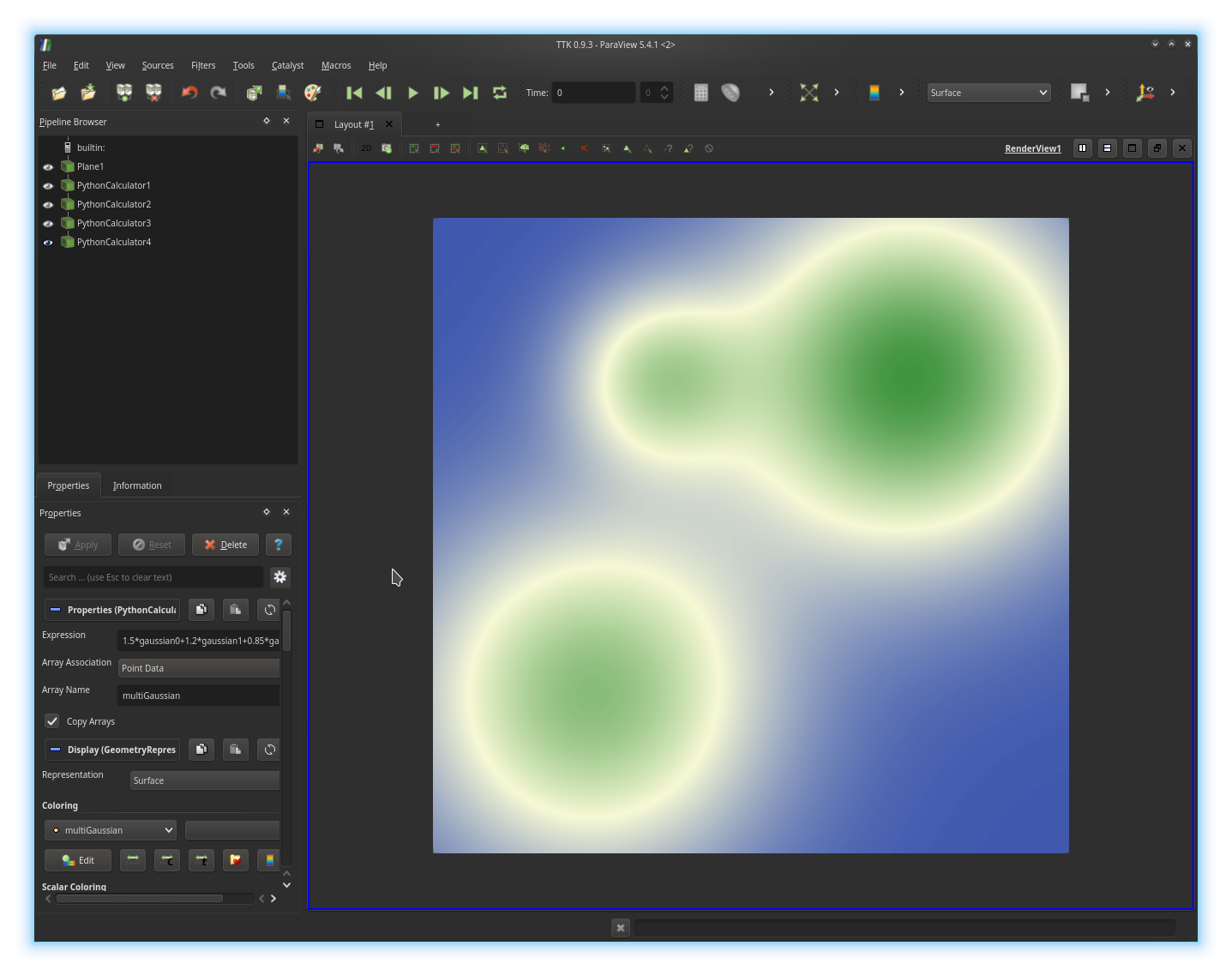
Exercise 2
We will now inspect this toy data set as a 3D terrain. First, create a new render view, by clicking on theSplit Horizontal button, located
in the top right corner of the current render view (next to the string
RenderView1). Next, in the newly created view, click on the
Render View button.To generate a 3D terrain, we will first triangulate the plane, which is currently represented as a 2D regular grid. For this, select the last
Python Calculator object in your pipeline and call the
Tetrahedralize filter on it. Next, we will modify the x, y and z
coordinates of the vertices of this mesh to create a terrain.To do this, we will use the
Programmable Filter and enter some
Python instructions to assign the previously define multi-gaussian function,
named multiGaussian, as a z coordinate. Programmable
Filters generate only one output, which is by default a copy of the input
geometry. Thus, to access the output of your Programmable Filter,
you need to use the Python expression output. Then, the z
coordinate of the output can be accessed, similarly as to the previous
exercise, by considering
the Python expression output.Points[:, 2].
The scalar data that we generated in the
previous exercise (multiGaussian) can be
accessed by considering the field multiGaussian on the point data
of the first input. This is achieved by considering the expression
inputs[0].PointData["multiGaussian"]. Now enter the correct Python instruction in the
Script text-box of your
Programmable Filter to assign the multiGaussian value
to the z coordinate of each point of the data and click on the
Apply button. If you got it right, you should be visualizing
something like this: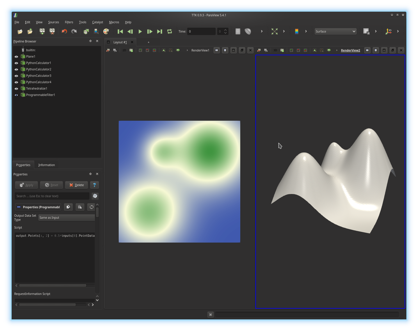
Programmable Filter have not been copied over to the output of the
filter. We will now copy the field multiGaussian, in order to
apply further processing on it. To add some data array to your output object,
you need to use the function append() on your
output.PointData object. This function takes as a first argument
the actual data array (in our case
inputs[0].PointData["multiGaussian"]) and as a second argument a
string, used to name the created data array (in our case, let us name it
multiGaussian too).Add a second instruction in the
Script text-box of your
Programmable Filter to copy the field
inputs[0].PointData["multiGaussian"] over to your output and click
on the Apply button. If you got it right, you should be
visualizing something like this: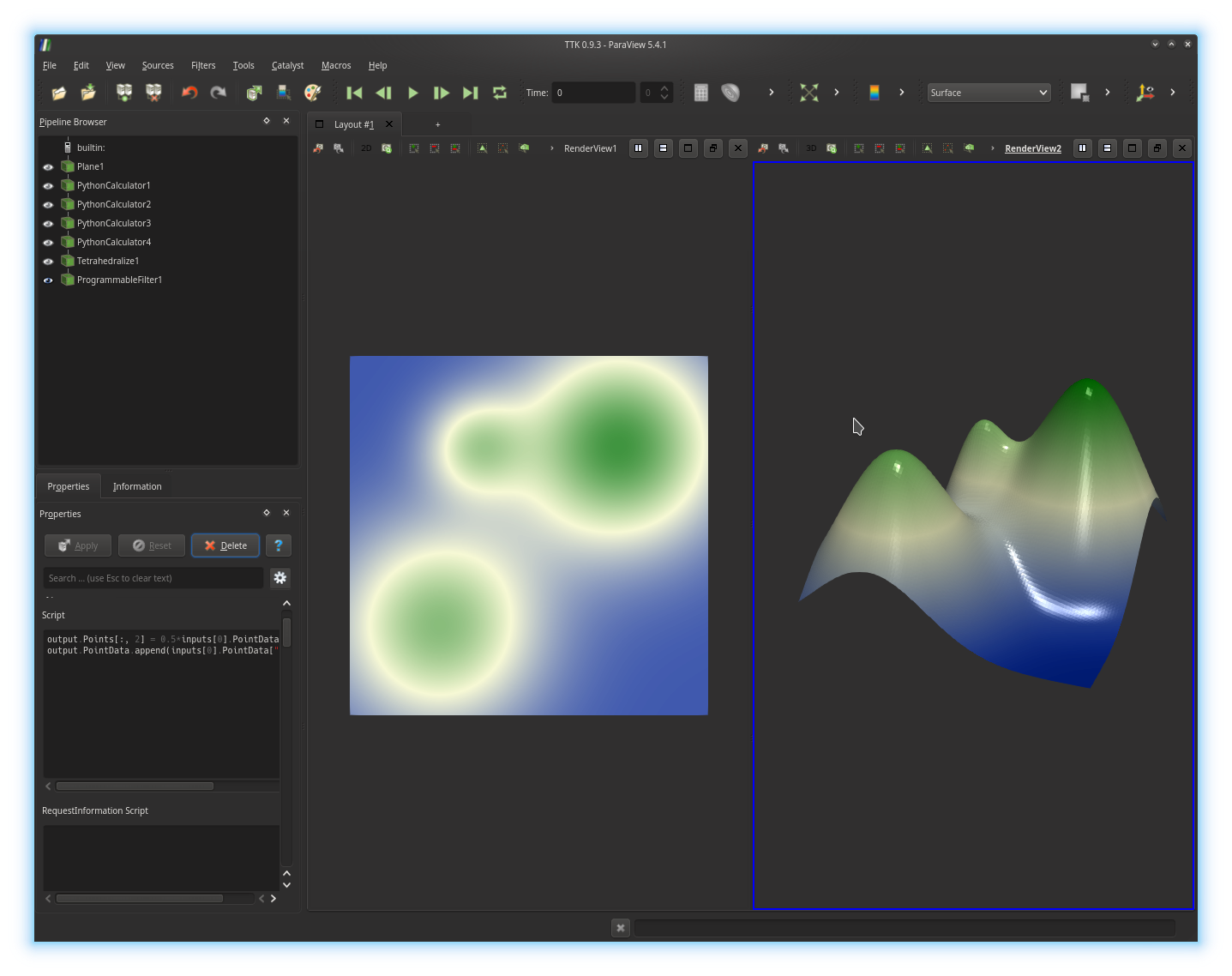
Programmable Filter, by enabling the eye icon on
its left. Adjust its display properties (Coloring,
Specular, Ambient and Diffuse)
to obtain a
visualization comparable to the above screenshot.
4. Sub-level set homology
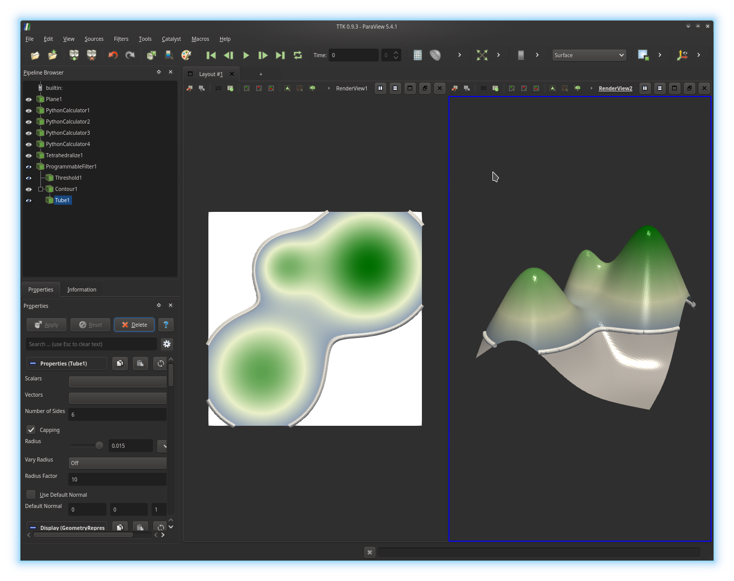
Exercise 3
We will now visualize and inspect the evolution of the topology (of the Betti numbersIn the pipeline browser, select your
Programmable Filter and call
the Threshold filter, to only select the points below on certain
isovalue of multiGaussian. Trigger the display of the
Threshold in both views, to obtain the following visualization:

Programmable Filter
and call the Contour filter and extract a level set at the same
isovalue. Next call the Tube filter on the output of the
Contour filter, to represent the computed level set with a
collection of cylinder primitives, in both views, as illustrated below:
Exercise 4
We will now animate the sweeping of the data and visualize the corresponding animation.In the
View menu, check the Animation View check-box.
The Animation View panel appears at the bottom of the screen. We
will first setup the length of the animation by setting the
EndTime parameter to 10 (seconds). Next, we will set
the frame rate to an admissible value (25 fps) and therefore set the parameter
No. Frames to 250.We will now specify which parameters of our visualization should vary during the animation. In particular, we want the isovalue (of the sub- and level sets) to continuously increase with time. For this, at the bottom left of the
Animation View, next to the + icon, select your
Threshold filter in the left scrolling menu and then, within
the right scrolling menu, select its
parameter
capturing the isovalue (Threshold Range (1)) and click on the
+ button. Next, also add the Contour filter to the
animation by selecting it
in the bottom left scrolling menu and
by clicking on the
+ button (the default selected parameter Isosurfaces
is precisely the parameter we want to animate). Your animation is now ready to play!
Go ahead and click on the
Play button at the top of the screen. If you got it right, you
should be visualizing
something like this:
· does
· does
· does
· does
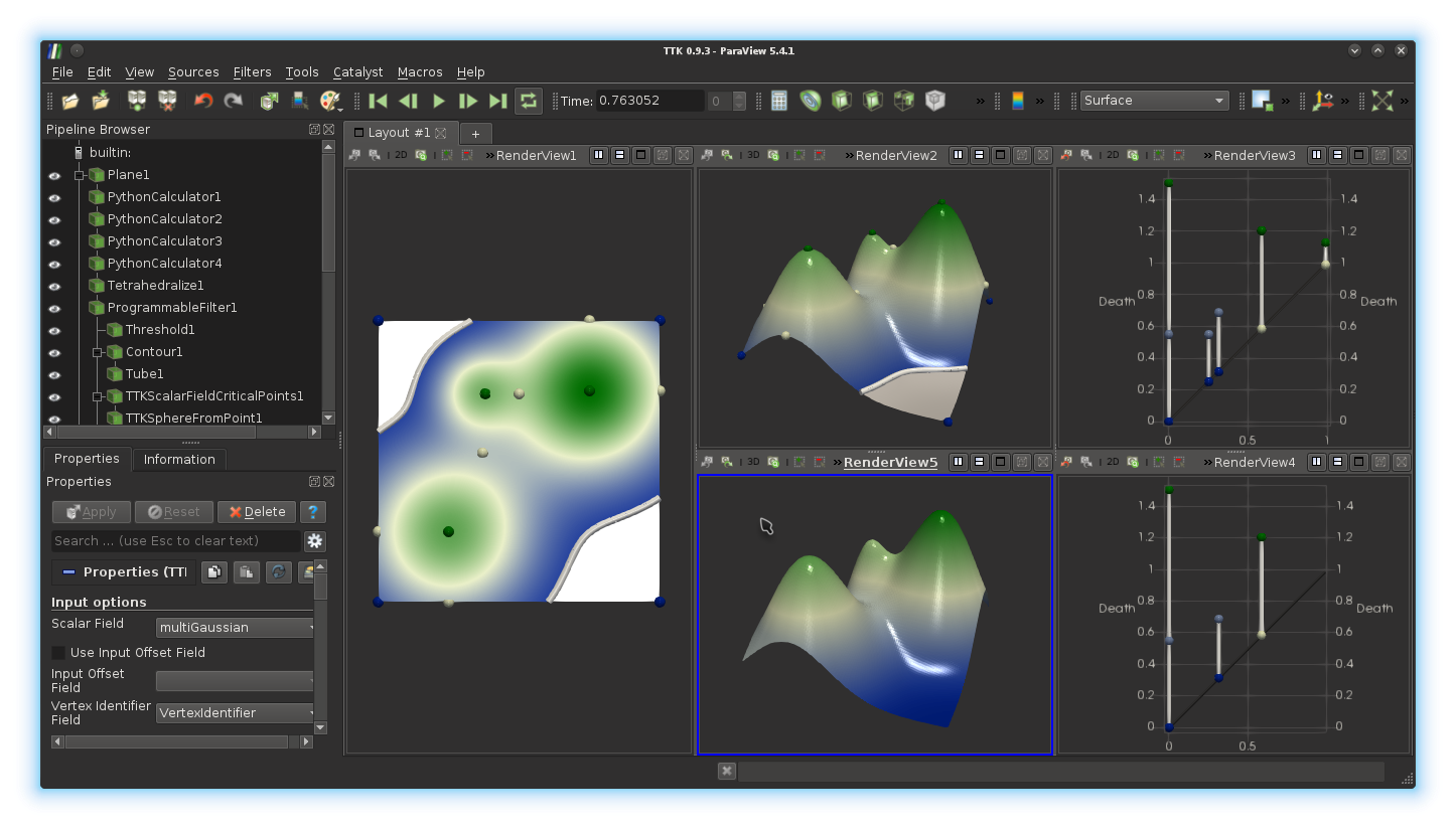
Exercise 5
We will now identify the exact locations in the data where the Betti numbers ofSelect the view with the 3D terrain by clicking in it. In the pipeline browser, select the output of your
Programmable Filter and call the filter
TTK ScalarFieldCriticalPoints on it.The output of this filter is a point cloud that may be difficult to visualize by default. We will enhance this visualization by displaying a visual glyph for each point, in particular, a sphere. Call the filter
TTK
SphereFromPoint
filter on the output of the TTK
ScalarFieldCriticalPoints filter and adjust the Radius
parameter. Next, change the coloring of these spheres, in order to use the
array CriticalIndex. Finally, select the 2D view on the left by
clicking in it and trigger the display of these spheres, with the same display
properties.
If you got it right, you should be
visualizing something like this:
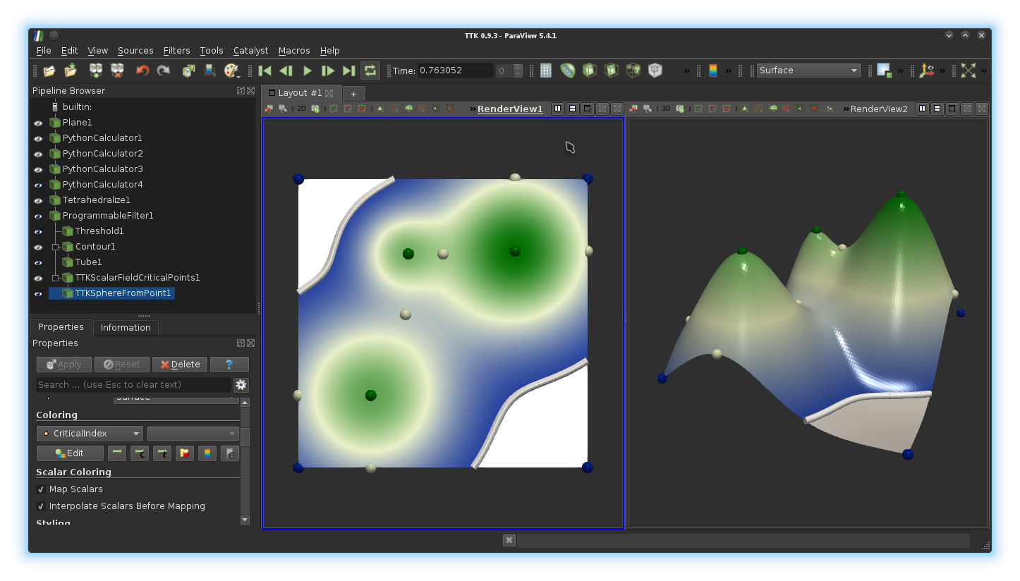
CriticalIndex (color-coded on the spheres)
relate to:· the increase of
· the decrease of
· the increase of
· the decrease of
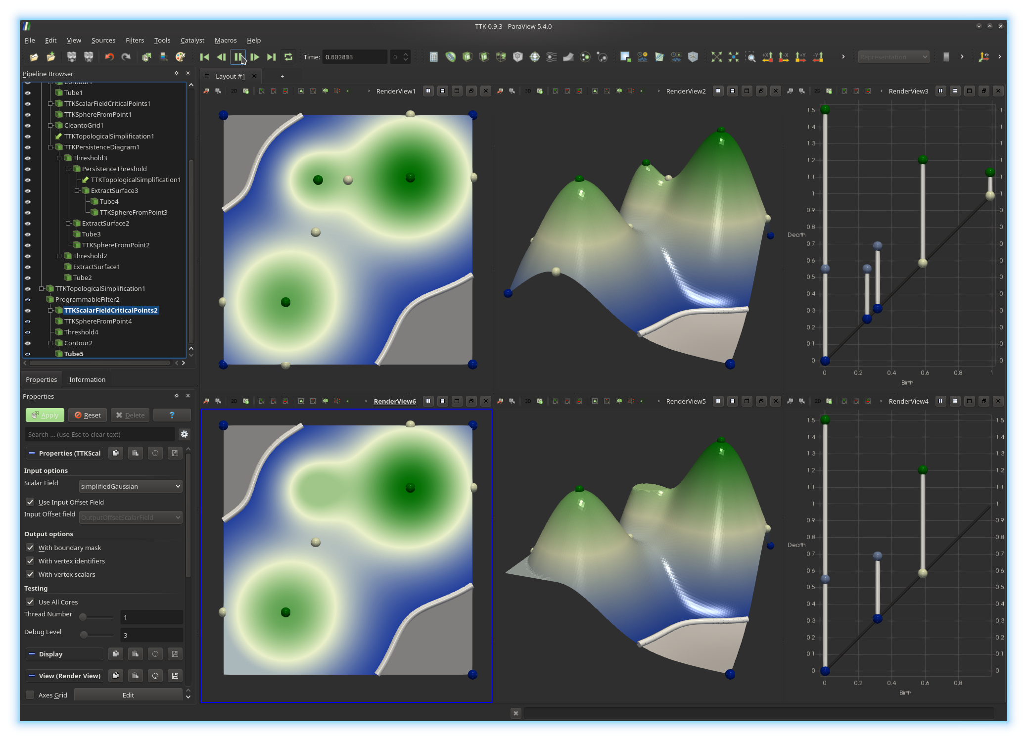
5. Persistent homology
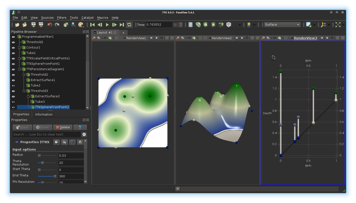
Exercise 6
We will now inspect this data from the view point of persistent homology.Create a third view on the right by clicking on the
Split
Horizontal
button, located at the top right corner of the right render
view (next to the string RenderView2) and then click on the
Render View button.In the pipeline browser, select the output of your
Programmable
Filter
and call the filter TTK PersistenceDiagram on it. A
persistence diagram should display in the newly created view.The visualization of the persistence diagram can be improved in several ways. First, in the display properties of the
TTK
PersistenceDiagram
filter, enable the display of the axes by checking the Axes Grid
check-box (you can tune its parameters, such as the name of the axes by
clicking on the Edit button next to it).Next, we will improve the visualization of the diagram itself. By default, the diagram embeds a virtual edge representing the diagonal. This virtual edge can be filtered out to be removed from the visualization or to be visualized with a distinct color. This virtual edge can be isolated from the others as it is the only edge with a negative value for the field
PairIdentifier. Use
the Threshold filter on the output of the TTK
PersistenceDiagram filter to isolate this edge. Next, convert your
selected edge to a polygonal surface representation by calling the
Extract Surface filter on it. Finally, represent this edge with a
cylinder primitive by calling the Tube filter (adjust the
Radius and coloring properties).Next, we will also display the actual persistent pairs with cylinders. For this, in the pipeline browser, select the output of the
TTK
PersistenceDiagram
filter and apply the Threshold filter on
it to only display these pairs with non-negative values for the field
PairIdentifier. Next, convert this selection into a polygonal
surface representation by calling the
Extract Surface filter and represent these edges with cylinder
primitives by calling the Tube filter (adjust the
Radius and coloring properties).Finally, we will represent each extremity of a persistence pair by a visual glyph, in particular, a sphere. For this, in the pipeline browser, select the output of the
Threshold filter which selected the pairs with
non-negative identifiers in the diagram and apply the TTK
SphereFromPoint filter on it. Adjust the radius and set the coloring to
use the field NodeType. If you got it right, you should be
visualizing something like this:
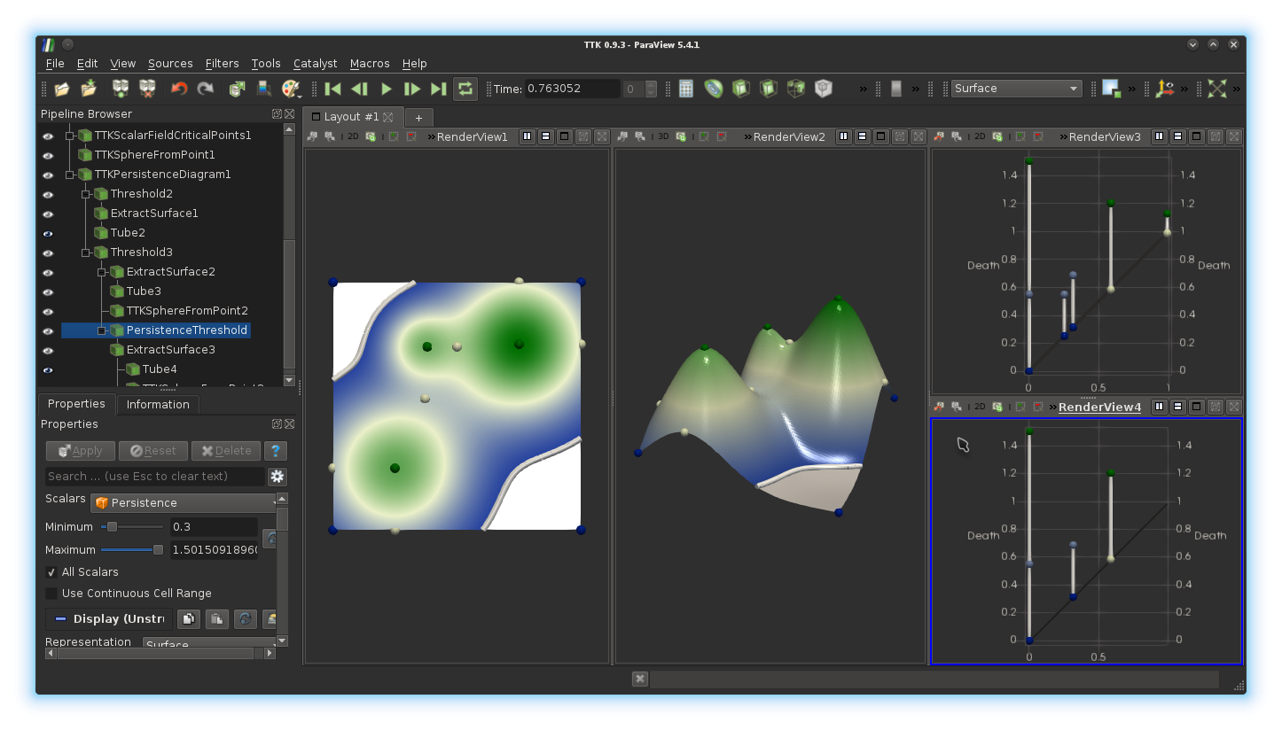
Exercise 7
We will now illustrate stability results on the persistence diagram and experiment with persistence-sensitive function simplification.Split the render view containing the persistent diagram using the
Split Vertical bottom (top right corner, second button after the
string RenderView3 and click on the Render View
button. In this view, display the diagonal of the persistence diagram as well
as the persistence pairs more persistent than the two pairs identified in the
previous question (use the Threshold filter on the
Persistence array to isolate those, as the pairs above a given
persistence threshold and below an arbitrarily high threshold, for instance
9999). Enhance the visualization, as suggested in the previous
question. If you got it right, you should be
visualizing something like this:
Before reconstructing the function
Programmable Filter and add a Python instruction in the
Script text-box to add a new field named
simplifiedGaussian which is a copy of the field
multiGaussian (see exercise 2).
Next, apply the filter Clean to Grid on the output of your
Programmable Filter, which will effectively perform the data copy.
Next, select the render view with the 3D terrain by clicking in it and split it vertically, using the
Split Vertical bottom (top right corner, second button after the
string RenderView2 and click on the Render View
button. Now, in the pipeline browser, select the output of the Clean
to Grid filter
and call the filter TTK TopologicalSimplification
on it. A dialog window opens to specify the two inputs of this filter. The
first
input, named Domain (see the left ratio buttons), should already
be set properly to your Clean
to Grid filter. The second input,
named Constraints (see the left ratio buttons), refers to the
persistent pairs which we want to keep in the reconstructed function
Threshold filter you used to select the most persistent pairs of
the first diagram Ok. Now, before clicking on the green Apply
button, in the properties panel, check the Numerical Perturbation
check-box, make sure that you are applying the simplification to the scalar
field simplifiedGaussian and
click on Apply . Link this terrain view with the
one
above by right clicking in the bottom view, selecting the entry Link
Camera... and then clicking on the top view. If you got it right, you
should be visualizing something like this:
simplifiedGaussian. For
this, select the filter TTK
TopologicalSimplification in the pipeline browser and call a
Programmable Filter on it and apply the same processing as in
the exercise 2 (but on our new field simplifiedGaussian). Do not
forget to copy the fields simplifiedGaussian and
multiGaussian.
Also, the filter TTK
TopologicalSimplification generates an offset field (or
tiebreak field) named OutputOffsetScalarField. Make sure to
also copy this field, as it is necessary to further process the simplified data
properly.
Update: as of version 0.9.6, this field is name
ttkOffsetScalarField by
default.
Now split the left view vertically, using the
Split Vertical bottom (top right corner, second button after the
string RenderView1 and click on the Render View
button. Click now on the 3D icon (top left corner of the view) to
switch it to 2D and trigger the display of the output of the
second Programmable Filter in it. Adjust its display properties
(Coloring,
Specular, Ambient and Diffuse)
to obtain a visualization that is consistent with the above view. Link this 2D
bottom view with the above one (right click, Link
Camera...).Next, we will extract the critical points of
Programmable Filter and call the filter TTK
ScalarFieldCriticalPoints. Before clicking on the Apply
button, check the check-box Use Input Offset Field and make sure
you are applying this filter to the scalar field
simplifiedGaussian. Finally, enhance this visualization by
displaying a sphere for each critical point, colored by its critical index, with
TTK SphereFromPoint, and display these spheres in both bottom views
(2D plane and 3D terrain).
Update: as of version 0.9.6, there is no need to check the box
UseInputOffsetField.
Input offsets are now automatically retrieved from the data, if present. To
force the usage of a specific field as vertex offset (advanced usage), check
the box ForceInputOffsetField.
Finally, we will extract and animate the sub-level sets
Programmable Filter and, similarly to exercise 3,
call the Threshold filter on it to display
Programmable Filter again and call the
Contour filter on it to extract Tube filter (to display it with cylinder
primitives) and trigger its display in both bottom views (2D plane and 3D
terrain). We will now complete the animation by animating the isovalue
View
menu, check the Animation View check-box and similarly to exercise
4, add At this point, your animation is ready to play!
Go ahead and click on the
Play button at the top of the screen.
If you got it right so far, you
should be visualizing something like this:
Threshold filter with
which you controlled the persistence threshold (beginning of exercise 7) and
increase that threshold until 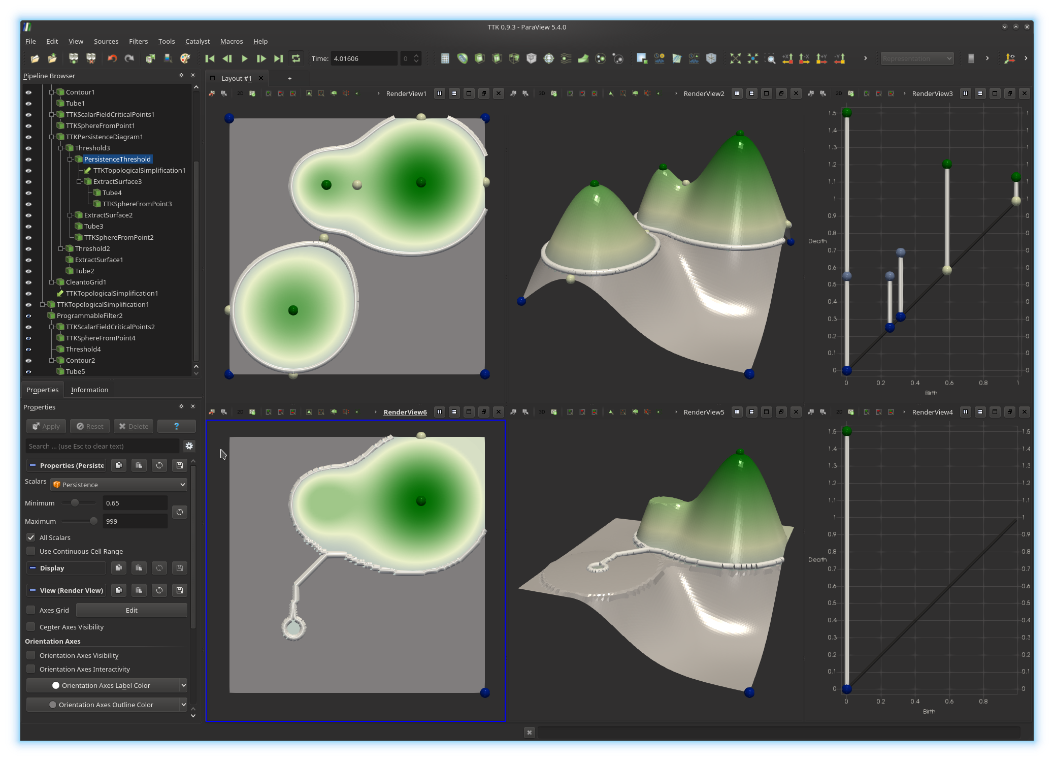
In the
TTK TopologicalSimplification filter, un-check the
check-box Numerical Perturbation and click on Apply.
How can you explain the disappearance of the artifact?
Exercise 8
We will now inspect the stability of the persistence diagram.Split vertically the top right view (containing the original persistence diagram
Split Vertical
button and click on SpreadSheet View. In the scrolling menu named
Showing, select from your pipeline the TTK
PersistenceDiagram and select in the Attribute scrolling
menu the entry Cell Data. This will display in a spreadsheet the
information associated with each pair of the persistence diagram, including its
persistence (last column), as shown below.
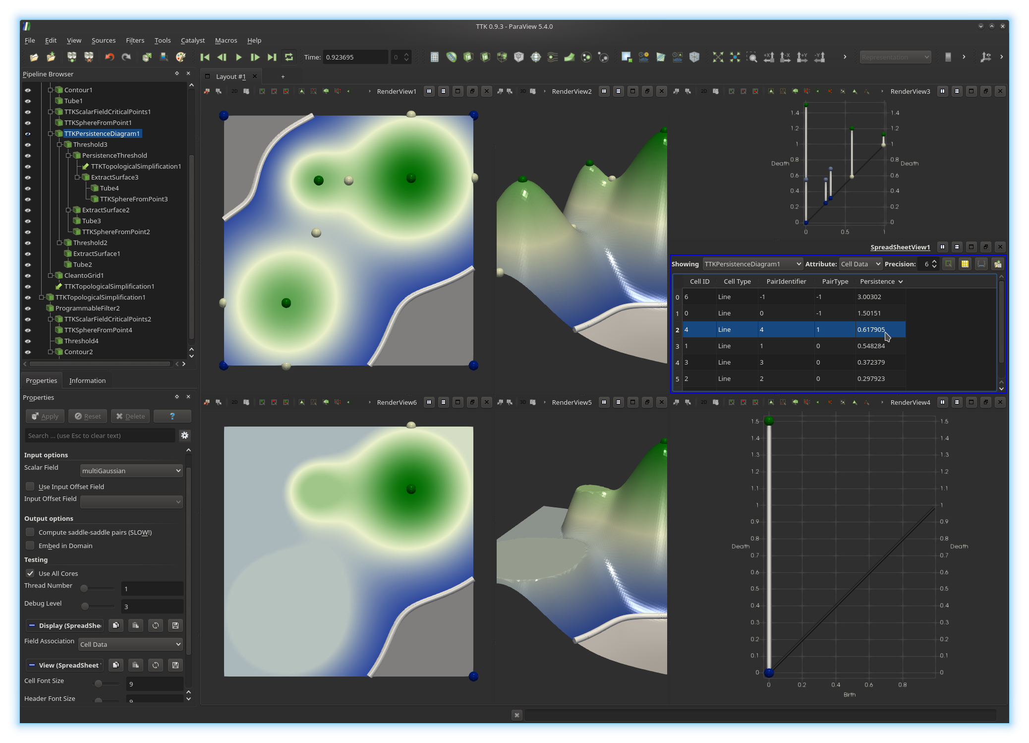
Now, write down the persistence of the most persistence pair which is absent from the bottom diagram below (
We will now evaluate
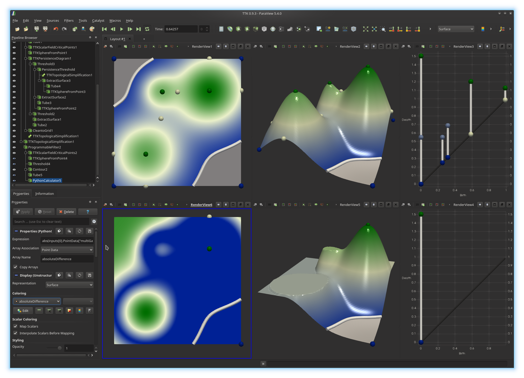
First, click in the bottom left view to activate it. Next, in the pipeline browser, select the output of the second
Programmable Filter and
call a Python Calculator on it. Now, enter the Python expression
to evaluate absoluteDifference.
If you got it right, you
should be visualizing something like this:
Split Vertical
button and click on SpreadSheet View.
In the scrolling menu named
Showing, select from your pipeline the last Python
Calculator.
This will display in a spreadsheet the
information associated with each vertex of the domain, including its
absoluteDifference value, as shown below.
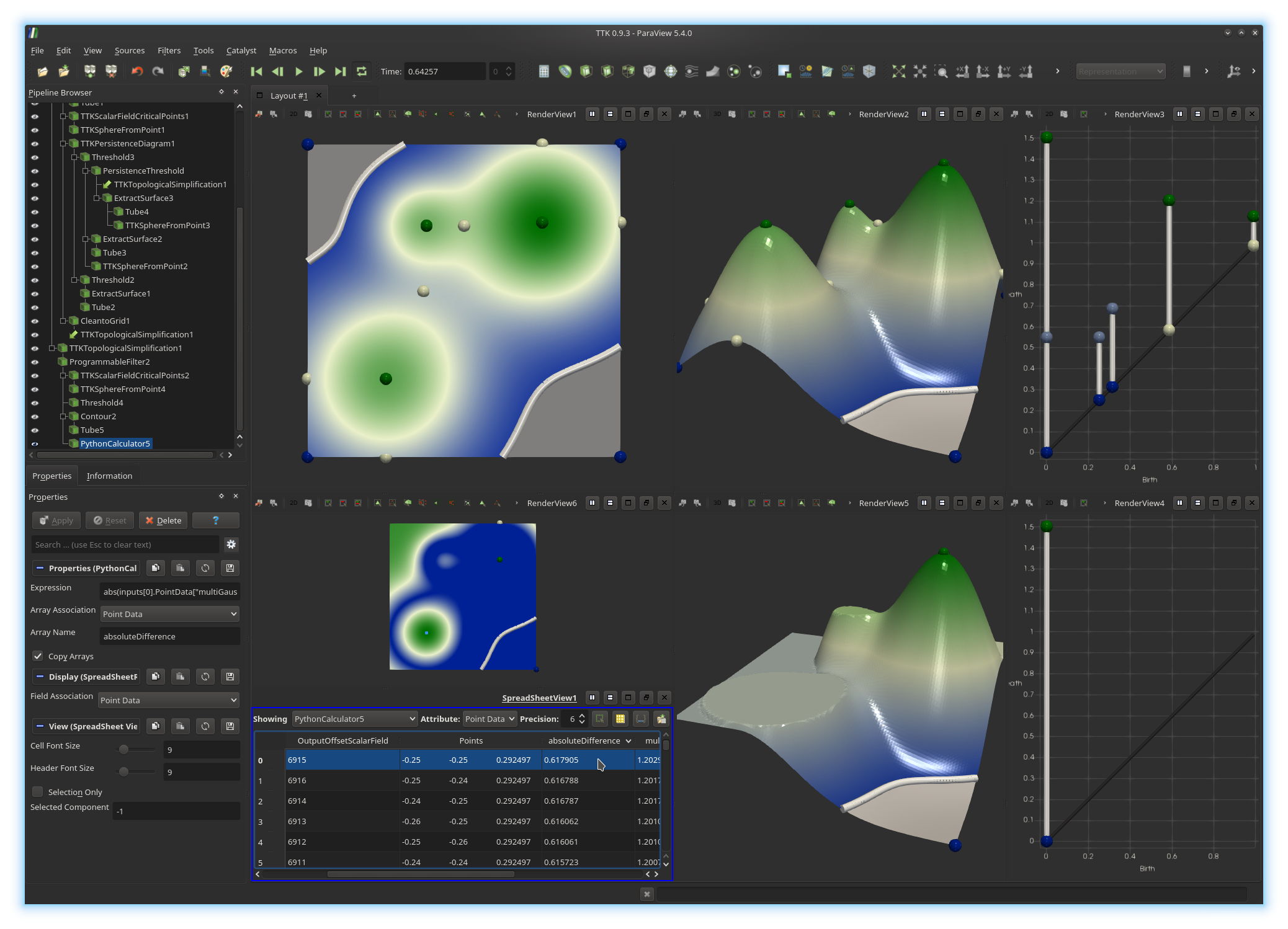
absoluteDifference
by clicking on the header of the
corresponding column.
Click on the spreadsheet entry that maximizes absoluteDifference.
You should see the corresponding point highlighted in the above view. What does this point correspond to?
How does its absolute difference value relate to the original persistence diagram?
6. Topological data segmentation
In our example, somehow, persistent homology helped us answer the following question:What is the second highest mountain of my terrain?
We saw that the answer is not necessarily the second highest summit (second highest local maximum) but the second most persistent summit.
We will now combine persistent homology and split trees, in order to extract precisely the geometry of the second highest mountain of our terrain.
Exercise 9
Click in the top center view to activate it. Next, in the pipeline browser, select the output of the firstProgrammable Filter and call the
filter TTK Merge and Contour Tree (FTM) on it (select
Split Tree as Tree Type). This filter generates
multiple outputs. Select the output Segmentation and change its
Opacity to 0.3. Now, you should see an embedding of
the split tree of your data. In the following, we will slightly enhance this
embedding.Modify the parameter
Arc Sampling of your TTK Merge and
Contour Tree (FTM) filter to a reasonable value (typically
10). Next, select its output Skeleton Arcs and call
the filter TTK GeometrySmoother and check the box Use Input
Mask Field. At this point, you may want to edit the number of smoothing
iterations (typically to 30), to obtain a smoother embedding of
the split tree. Next, we will display the arcs of the tree with cylinder
primitives. For this, call the Extract Surface filter (to convert
the arcs to a polygonal representation) and then the Tube filter.
If you got it right, you
should be visualizing something like this:

TTK Merge and
Contour Tree (FTM), remember to use the simplifiedGaussian
field and to check the box Use Input Offset Scalar Field. At this
point, you may want to reduce the persistence threshold (beginning of exercise
7), to obtain a visualization like this one:

UseInputOffsetField.
Input offsets are now automatically retrieved from the data, if present. To
force the usage of a specific field as vertex offset (advanced usage), check
the box ForceInputOffsetField.
Exercise 10
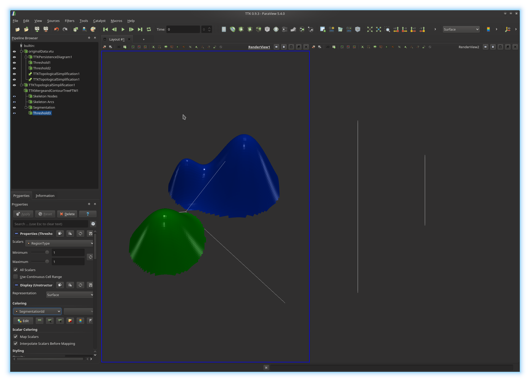
Thanks to the split tree, the geometry of each mountain can be extracted by collecting the set of vertices of the domain which map to arcs in the split tree which are connected to local maxima. We will now extract these regions.Click on the top center view to activate it. Now, in the pipeline browser, select the
Segmentation output of the first TTK Merge and
Contour Tree (FTM) filter. Now, apply the Threshold filter,
in order to only show these vertices that have a RegionType value
of 1. This will extract all vertices mapping to arcs connected to
local maxima. Change the display properties of these vertices to color them by
the field SegmentationId (you can edit the color map by clicking on
the Edit button). Trigger their visualization in the top left
view, with the same coloring scheme.
You should now be visualizing something like this:
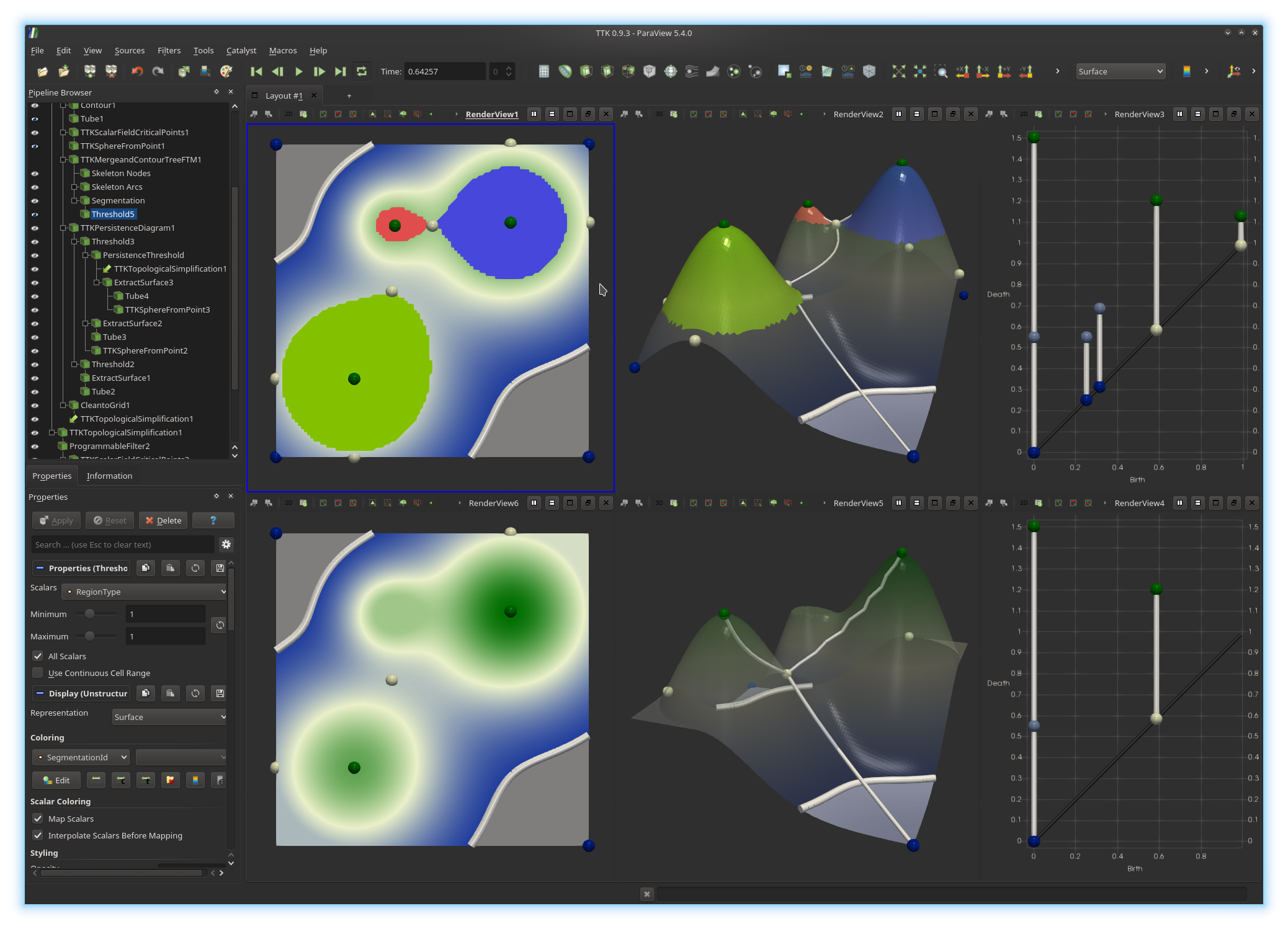
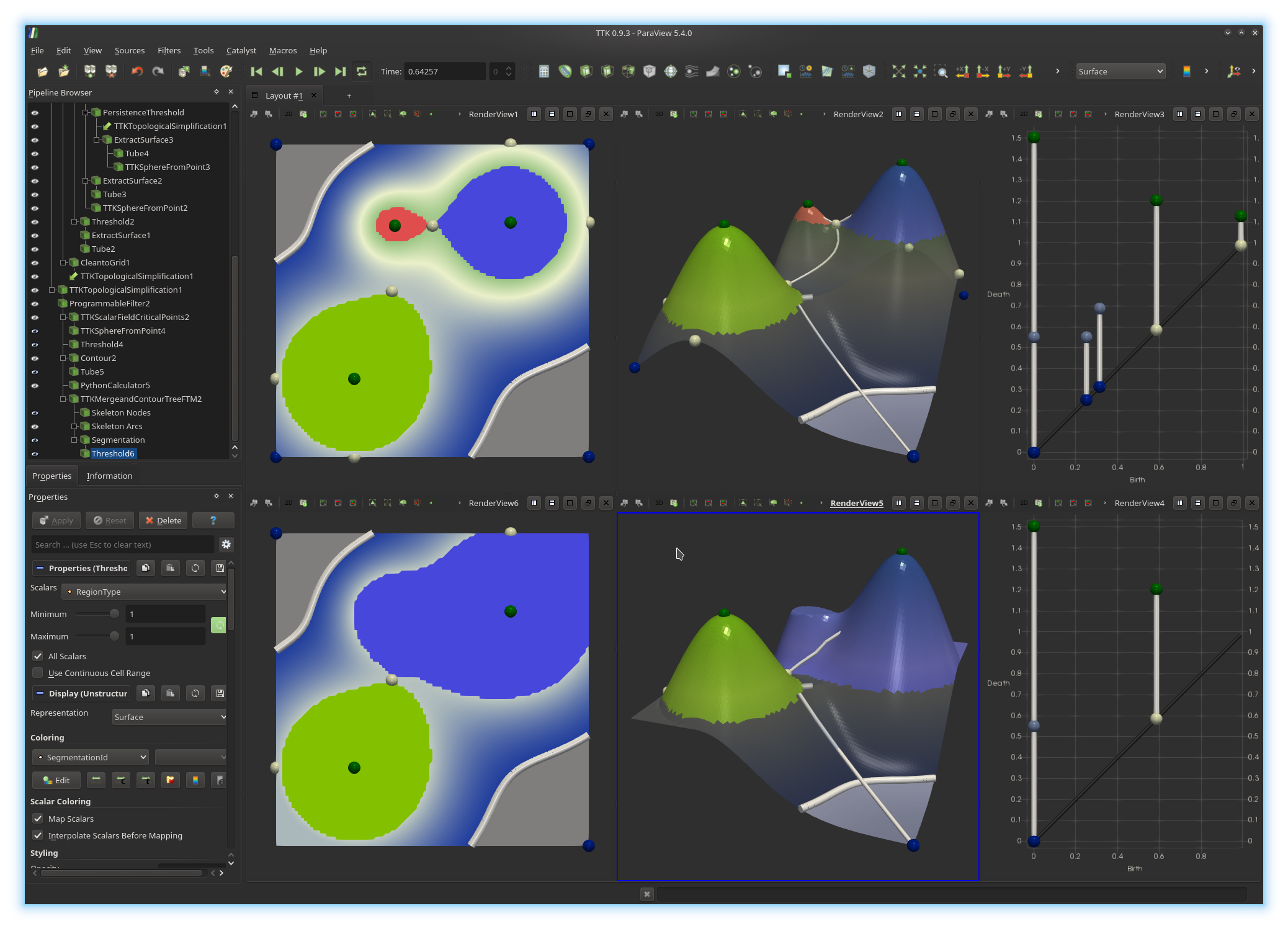
You've just extracted the geometry of the two highest mountains of your terrain (bottom views). You can now play with the persistence threshold (beginning of exercise 7) to explore the hierarchy of your data segmentation.
6. Topological data segmentation in Python
We will now implement a similar analysis pipeline in Python, thanks to ParaView Python export capabilities.Exercise 11
First, in your pipeline browser, select the output of your firstProgrammable Filter (corresponding to the first, non-simplified 3D
terrain). Next, save this data to disk with the menu File,
Save Data... (select the vtu file extension). You can
now close ParaView.Re-open now ParaView and load the file you have just saved. Split the current view horizontally and compute and display the persistence diagram of your data in this new view.
Now threshold your diagram to remove the diagonal and threshold again to remove low persistence pairs (see exercise 7). Next, activate the left view by clicking in it and select your 3D terrain in the pipeline browser and call the
TTK
TopologicalSimplification
filter on it, using as constraints the persistent pairs you selected
previously from the persistence diagram (see exercise 7).Next, compute the split tree of the simplified data (see exercise 9, do not forget to check the box
Use Input Offset Scalar Field). Finally,
threshold the Segmentation output of the split tree, to only
visualize vertices with a RegionType value of 1.
Update: as of version 0.9.6, there is no need to check the box
UseInputOffsetField.
Input offsets are now automatically retrieved from the data, if present. To
force the usage of a specific field as vertex offset (advanced usage), check
the box ForceInputOffsetField.
At this point, you should be visualizing something like this:
File, Save state... and choose
the Python state file type and save your file with the name
pipeline.py.We will now turn the generated Python script into an independently executable program.
This script relies on the Python layer of TTK and ParaView. It should be interpreted with
pvpython, which wraps
around the
traditional Python interpretor, in order to set the required environment
variables properly. To automatically run the script with the right interpretor,
we will add the following line at the very top of the generated script:
#!/usr/bin/env pvpython
Next, we will make the script executable by setting its execution bit, by entering the following command (omit the
$ character):
$ chmod +x pipeline.py
Your Python program can now be run by simply entering the following command (omit the
$ character):
$ ./pipeline.py
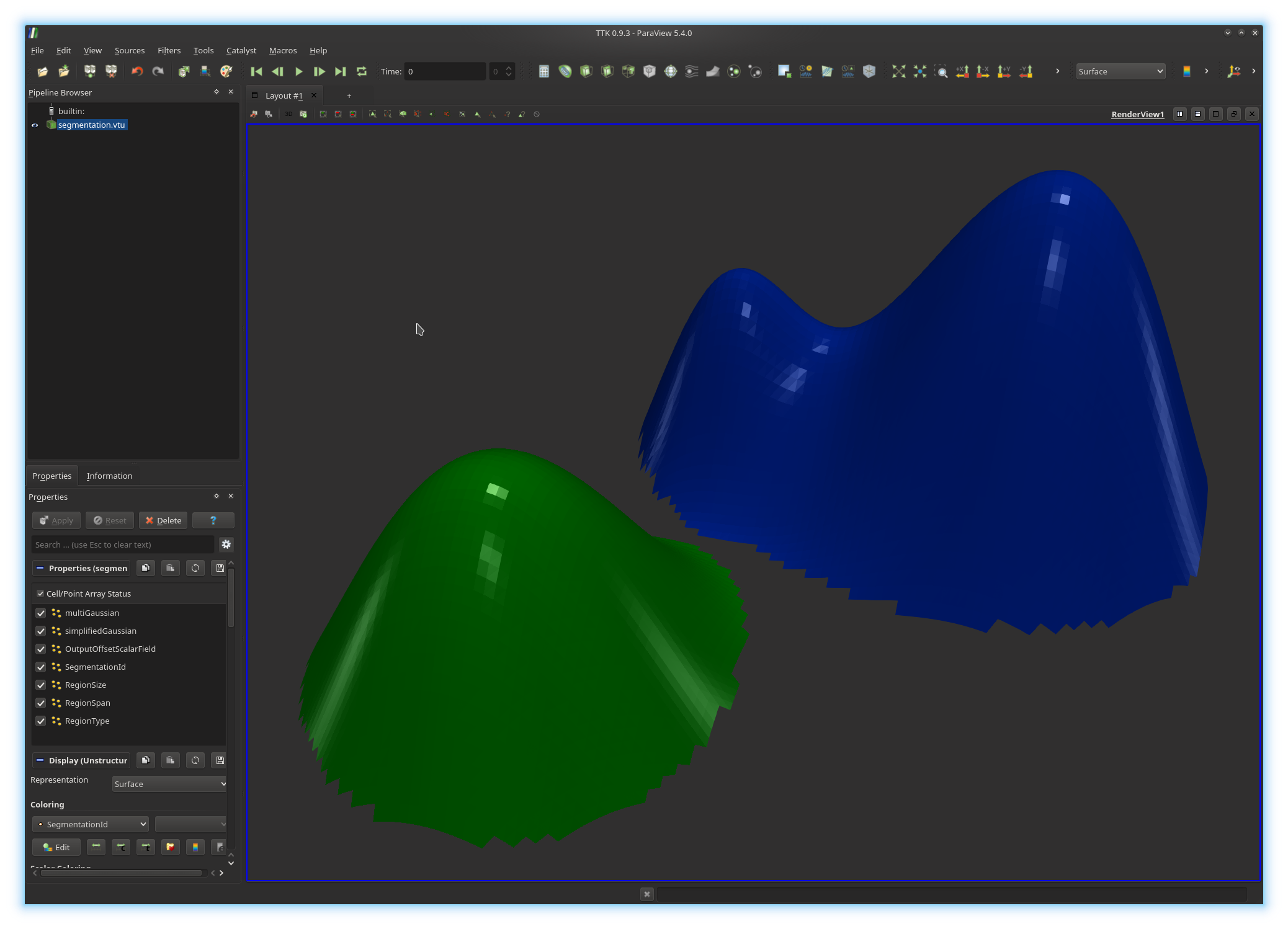
By default, this program loads the input terrain, simplify the data, segment the mountains with the split tree and simply exits. We will now modify this script to store to disk the segmentation of the highest mountains.
For this, open the script with a text editor and identify the part of the script which thresholds the segmentation according to the
RegionType field.
After this paragraph, add a Python instruction to save the
Threshold object to disk, with the function
SaveData(), which takes as a first argument a filename
(for example
segmentation.vtu)
and as
a second argument a pipeline object (here the instance of
Threshold object). Save your file and execute your script. It
should have written to disk a file named segmentation.vtu. Open it
in ParaView. You should be visualizing something like this:
segmentation.csv instead of
segmentation.vtu and run your script again. It should have
produced a plain ASCII file storing the segmentation, which can be opened and
parsed with any other software.Exercise 12
Note that, in our Python script, the instructions located after the saving of the segmentation deal with rendering parameters. Thus, these can be removed in our context since we are using the script in batch mode. Other instructions related to render views can also be removed for the same reason.Remove all the Python instructions that are not strictly necessary for the computation of the output segmentation. At this point, your script should have less than 25 instructions and should therefore be much easier to read.
Exercise 13
Now edit your Python script in order to read the persistence threshold with which the data should be simplified from the command line, as an argument of your Python script.
7. Topological segmentation of medical data
We will now apply our topological data analysis pipeline to some real-life medical data.For this open with ParaView the following data set:
~/ttk/ttk-data-0.9.3/ctBones.vti
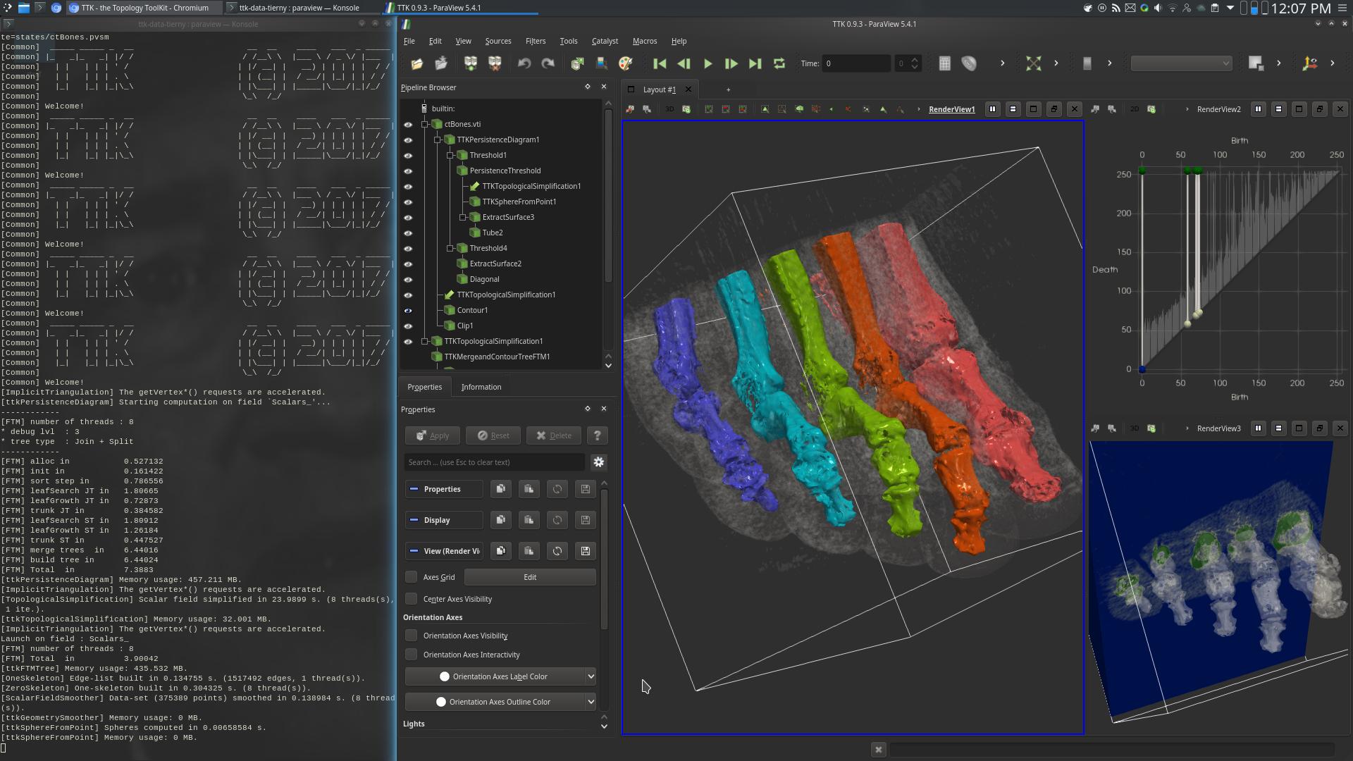
Now, deploy the topological data analysis pipeline we designed in this tutorial, in order to segment the 5 highest mountains of this CT scan:
· Computation of the persistence diagram of the data;
· Selection of the 5 most persistent pairs;
· Topological simplification of the data according to the persistence selection;
· Computation of the split tree of the simplified data;
· Segmentation of the regions mapping to branches of the split tree connected to maxima;
If you got it right, your pipeline should precisely isolate the bones of the foot and you should be visualizing something like this: